I joined Airy when the product was in its early stage. The company had iOS, Android, and Web apps, each with different interfaces, experiences, and solutions for the same problems. My first task was to conduct an audit and identify all the inconsistencies. Once that was done, I proceeded to create a basic component library. Meanwhile, we started delivering features and redesigning parts of the app. Although developing a design system was still impractical due to the size of the team and company, I made sure to keep it in mind throughout the process. This step was crucial in speeding up front-end and design work while maintaining consistency.
By focusing on the business case, strategy, and leveraging usage data, we were able to make informed decisions about changing, adding, or removing certain features. Working on various aspects and flows of the app, both small and large, provided me with valuable opportunities. I had the chance to contribute to the improvement of the app's functionality, user experience, and overall performance.
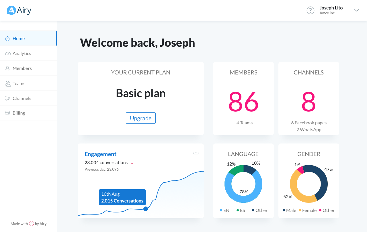
As the company grew in size and acquired more clients, we realized the need to create a separate admin area specifically designed for managers. This area was intended for them to easily access analytics, channels, and member information, providing a better overview without the need to interact with the inbox interface, which is primarily targeted towards agents.


Over the nearly two years that I've been working for Airy, we have essentially built a product from scratch and continue to iterate on it. We simplified the mobile apps to focus solely on messaging exchanges, while all account-related processes became browser-based. This significant change helped reduce maintenance costs and decreased the number of QA test scenarios, allowing the team to concentrate on other areas.
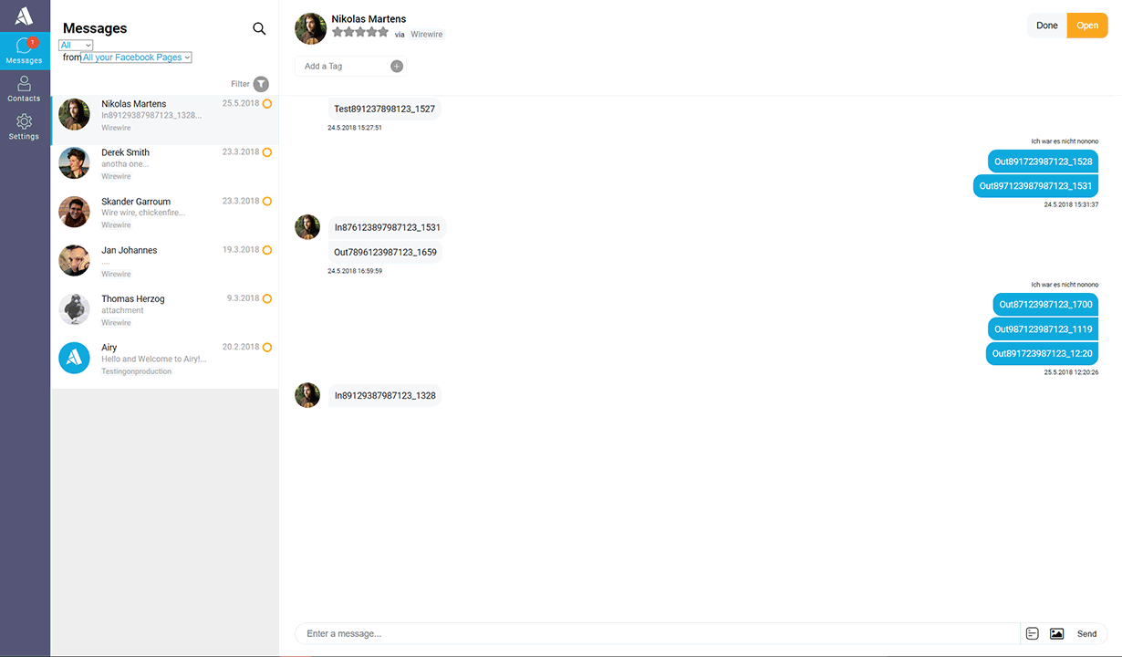
The continuous iteration also provides opportunities for redesign. While the redesign of the inbox interface was done to align with the UI language of the admin dashboard, it was primarily a design decision aimed at improving the experience for agents. The focus was on enhancing aesthetics and incorporating microinteractions to enhance common activities.

Business Impact
The admin area proved to be a crucial element for individuals who did not necessarily need to interact with the inbox product.
The continuous iteration also elicited numerous emotional reactions from customers who felt that their voices were valued within the product. This, in turn, improved the customer-business relationship.
Learnings
Of course, life is not always a bed of roses. There were some valuable lessons learned during the process, such as reconsidering certain UI decisions or features. The tags manager, in particular, had numerous conditions and proved to be quite complex from the start. While the feature itself was useful, we invested a significant amount of time in the design and development phase to ensure its accuracy. A minimum viable product (MVP) approach would have been more efficient, allowing us to gather insights from agents using the app and gradually add improvements based on their feedback.
Conclusion
Working with such a large and dynamic product, alongside a highly experienced team, enhanced my professional experience and emphasized the impact that design can have on the business. It also forced me to understand and learn more about SaaS and, consequently, software – with all its limitations and specifics.
