Born in Brazil, living in Berlin. I solve problems by using human centered design approach. I’ve been learning and doing design over 10 years.
Role: Principal Product Designer
Check it out: Sesamecare.com
Sesame Care is a superstore for doctors, drugs and labs with affordable self-pay prices and without insurance. Great for both healthcare providers and patients.
Airy's vision is to make the communication between people and companies seamless through messaging.
Role: Senior UI/UX Designer
Check it out: app.airy.co
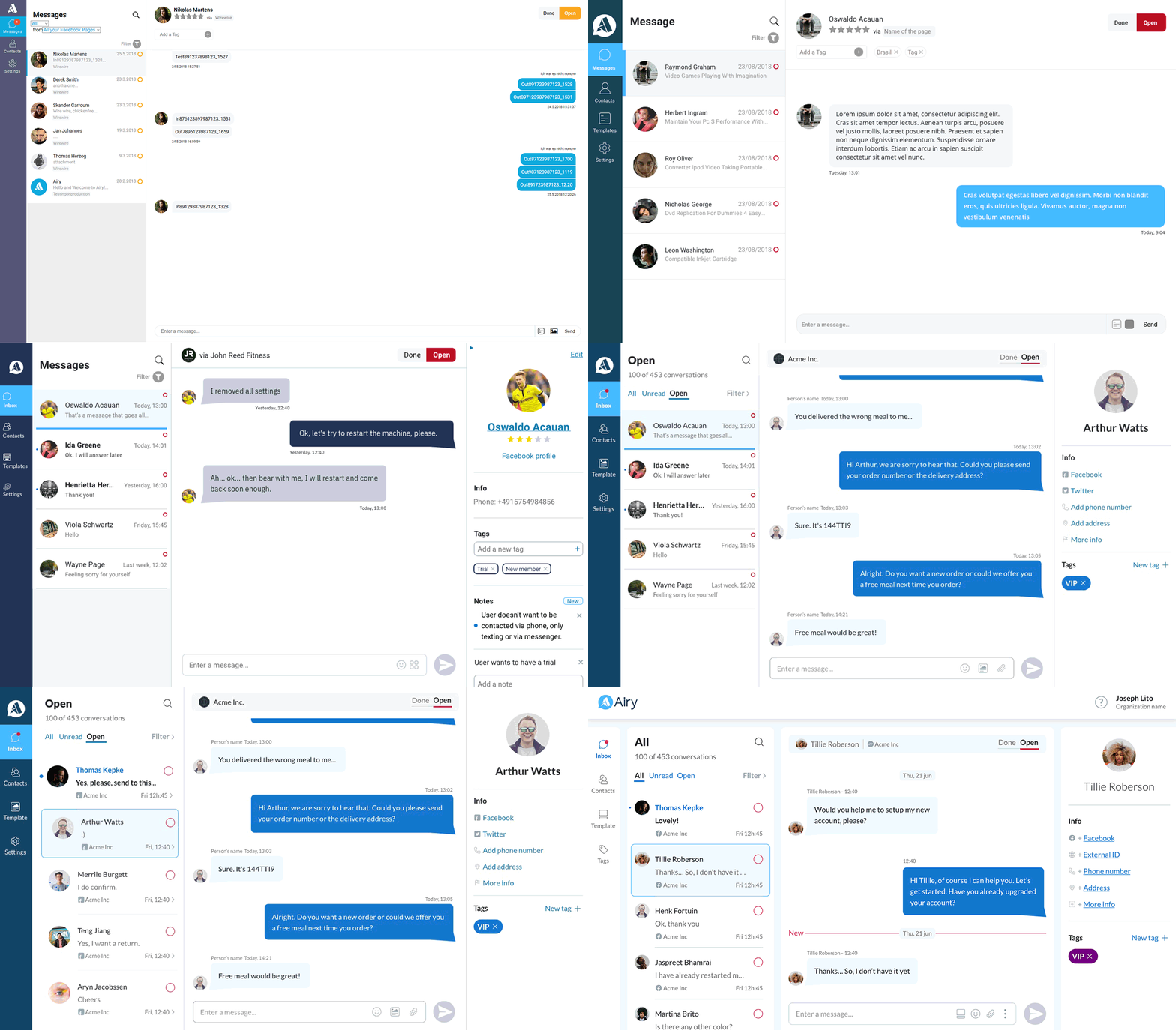
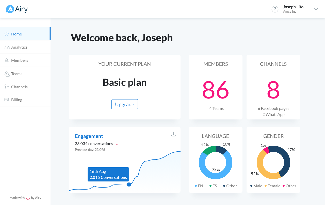
Airy is a global SaaS app that provides a full-cycle messaging experience, covering Customer Support to Customer Acquisition. Upon joining Airy, I revamped the user experience, including signup, interactions, and UI. Over the past two years, we continuously iterated the product based on user research and observations, introducing and refining features. Simultaneously, I collaborated closely with the Front-end team to create a component library for multiple apps.
A project that took over a year, involving market research, brand conception and the designing of all other print and web pieces.
Role: UI/UX Designer
Year: 2018
The design team went all out and gave a fresh makeover to the imagery, typography (including a fancy custom type), colors, logo, and brand message.
Rooster Punk handled the brand strategy, while our in-house team at Funding Circle took charge of the rest of the design work. As part of my main duties, I was responsible for the German and Dutch markets and sprucing up the walls in all our offices.
Revamping the whole flow from signup to the final "Invest" button
Role: UI/UX Designer
Year: 2018
Imagine a product that had not been touched for over 3 years and was launched without any user research, resulting in a broken investor experience for the end user.
The team decided to improve it, and to gain company buy-in, we created an "ideas mural" where people from all departments could share their inputs, ideas, and feedback.
Simultaneously, we started conducting investor research and analysis, utilizing all available data. With that, we were able to identify different investor personas based on registered users and found a few candidates for interviews.
Using these insights, I developed the prototype for the new version of the product, considering every problem and idea we received. I also created a script for the Usability Test.
Meanwhile, we commenced investor research and analysis using all available data. We identified their profiles based on registered users and reached out to different individuals for interviews. Additionally, we invited people who were unfamiliar with Funding Circle but had previous investment experience, selected through a recruitment agency.
I developed the prototype addressing all the highlighted problems and ideas, and created a script for the Usability Test, targeting both the German and Dutch markets.
I was able to learn a lot about our users in this process: their incentive to invest, how they perceived our product and how/if the prototype would be a better solution to what they had already.
Through this process, I gained valuable insights about our users: their motivations to invest, their perception of our product, and how the prototype could potentially provide a better solution. With overwhelmingly positive feedback, we received the green light to implement this new version of our product.
A new flow – 100 % more conversion
Role: UI/UX Designer
Year: 2017
We invited borrowers (both new and current users) from the Netherlands and Germany to interview and test a prototype of the new borrower signup application.
A new flow was implemented, featuring a complete redesign and automation of public data to simplify the user experience.
Through user testing and Funnel Analysis, one of the main findings was that completing the value entry was more crucial in generating leads and sales than having all the data perfectly fulfilled, such as documents, for example.
As a result, we added this step to the end of the application so that users could return at any point and easily upload their documents.
Outcome: Within the first week after the launch, we observed a remarkable 100% increase in conversion rates.
Natura’s SOU is a line focused on the everyday treatment.
Role: Art Director
Year: 2013
In this featured microsite, a Front-End developer and I developed an interactive movie with mouse-scroll control done in After Effects + Photoshop, in which people can see the lines for Straight Hair and Curly Hair.
I have completely redesign Airy's website using Webflow
Role: Senior UI/UX Designer
Check it out: airy.co
From concept to delivery, the website was delivered in about 4 weeks. I worked closely with the marketing team to reach content and definition of animations. In this project we also created more consistency with the Product and across the entire experience.
Animations were done on After Effects and brought to life using Lottie. All transitions were done on Webflow.
"Just" an UI redesign.
Role: Art Director
Year: 2013
Natura has amazing products and beautiful images. But the product modals were poorly designed and reduced to the product and its price only. Once redesigning we brought up the concept that, even though it is an e-commerce, this page could also sell branding, show promotions and exclusive offers in a beautiful way.
The time spent on the page increased significantly. Users felt also more confortable in acquiring the product, since they had more information about it.
Campaign for Chevrolet Brazil to raise awareness among the public and the media about the dangers of texting and cell phone use behind the wheel.
Role: Art Director
Year: 2012
“Chevrolet – Every text hides a danger. Don’t text and drive”
Creative Directors: Vitor Hayashida / Hugo Rodrigues
Art Directors: Filipe Trabbold / Mikael Correa
Copywriter: Américo Vizer
Retouch and illustration: Burti
Campaign for Chevrolet Brazil selling the Break Assist feature
Role: Art Director
Year: 2012
“Chevrolet Brake Assist – Be prepared for any situation”
Creative Directors: Vitor Hayashida / Hugo Rodrigues
Art Directors: Filipe Trabbold / Mateus Vilela / Vitor Hildebrand
Copywriter: Fernando Brandt
Image and illustration: Platinum
Logos and Brands I've had the opportunity to create along my career.