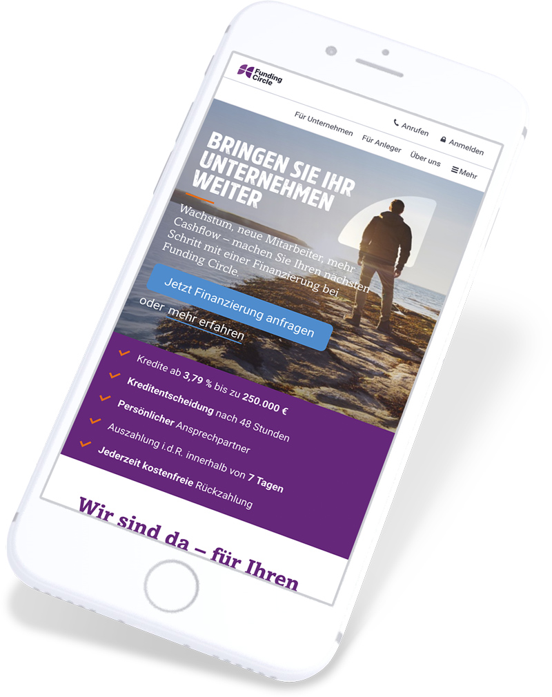
The main challenge of this project was to design a global brand that was consistent across all geographies where Funding Circle is present: Germany, The Netherlands, The USA and UK.
The consistency factor was always an issue, since Funding Circle started in the UK and acquired two other companies to enter in the German, American and Dutch markets. Meaning that we had three different platforms, with different code base and three design teams.
The project took place for more than a year, involving market research, brand conception and designing all other print and web pieces.
We reworked completely imagery, typography – including a new personalized font – colours, logo and brand message.
Brand strategy was developed by Rooster Punk, all other design work by Funding Circle's internal team. My main duties were to design for German and Dutch markets and all offices' walls.
Natural and inspiring case studies. That's how we treat photography. We had case studies before, but our focus was on the borrowers, proud of their businesses. Now we capture them not only proud, but doing what they do best, every day: Taking care of their companies.
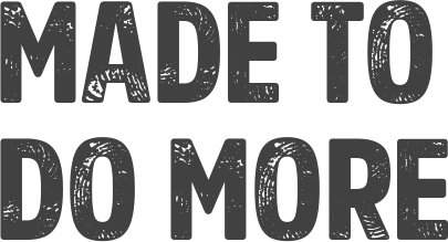
"Made To Do More". It means that we connected businesses owners, investors and the people working at Funding Circle with a driven positive attitude to work and life, full filled with a lot of determination.
Based on featured elements and fonts that would work well with both numbers and good readability we introduced Roboto and Amasis to our style, but font that creates a real connection with our message is the Self Made Sans – a font made of employee and clients finger prints.

Our global design and front-end team work with components inside a custom front-end framework that was updated to match our new needs.
All offices received a facelift using Funding Circle's brand values and inspirational photos
Check it out: fundingcircle.com


